A friend sent me a leaderboard. Six "PPT skills" for Claude, ranked and scored to the point — 94, 88, 87, 86, 83, 80 — with a tidy table of strengths and weaknesses for each. The question attached was fair: for someone like us who actually makes decks for clients, is the one on top worth installing?
I almost answered from the table. Then I noticed the thing that made me close it and open a terminal instead.
The skill ranked third, scoring 87, has zero stars. It sits one line above a tool with 23,400.
That's not a rounding detail. That's a leaderboard telling on itself.
What the board actually measures
The rubric is stated honestly enough: PPT production ability is worth 70 points (narrative, visual, output, QA, delivery), skill engineering quality is worth 30, and — to its credit — GitHub stars are explicitly not counted. There's even a disclaimer in the fine print: the scores are "based on each repo's current implementation and example cases, not a blind same-prompt bake-off."
Read that line twice, because it quietly dismantles the whole thing. Nobody gave the same deck to six tools and compared what came out. Someone read six READMEs and rated the sales copy. A product brochure and a finished product are not the same artifact, and the distance between 94 and 80 is the distance between brochures.
The 0-star-at-number-three result is the tell. A scoring rule that says "stars don't count" happens, very conveniently, to protect the one project nobody is using. That same project has no native PPTX renderer and no editable-PPTX example — meaning it can't yet do the one thing the rubric weights most heavily — and it still outscores tools that demonstrably can. The simplest explanation is that the board was made by, or leans toward, that project. It's the classic "I'll rank my own tool second — no, third, that reads as more modest."
So I kept the one genuinely useful part — the weakness column, which is mostly honest — and threw out the ranks. Then I ran the bake-off the board had skipped.
One brief, three real decks
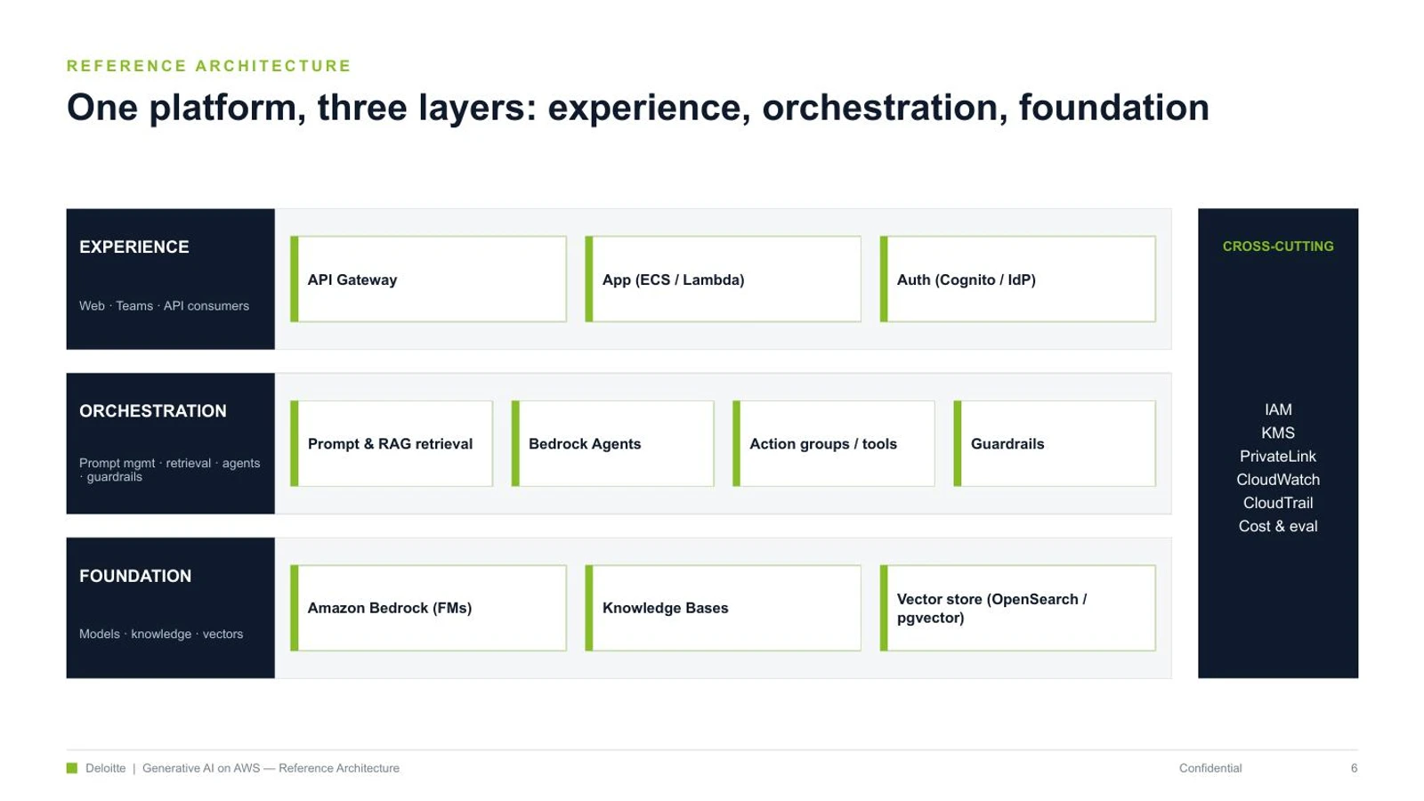
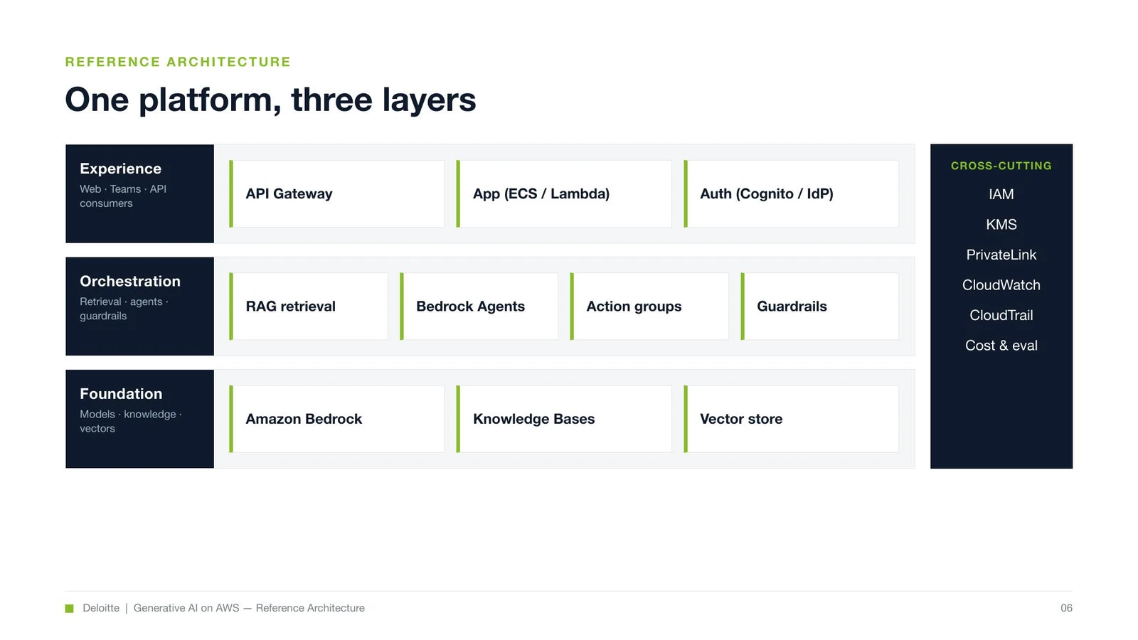
A fair comparison needs a single source of truth, so I wrote one brief and handed it to each tool verbatim: a GenAI on AWS reference architecture — enterprise generative AI built on Amazon Bedrock — 20 pages, Deloitte-minimalist styling (navy and green, action titles, structured exhibits, almost no decorative anything), aimed at client-side architects. The kind of deck I actually have to make. Same content outline, same palette, same page count. The only variable is the tool.
Deck A — the built-in pptx skill (the one that ships with Claude; nothing to install). Its approach is unglamorous: write a ~500-line pptxgenjs script that emits native PowerPoint objects, run it (node, about a second), render the pages to images, then run a fresh-eyes QA pass. Sixteen of twenty slides were clean on the first render; four needed geometry fixes — a matrix overflowing its quadrant, a table column running wide, the networking diagram, the roadmap gantt. Fix, re-run, done. The output is a 634 KB .pptx where every shape is a real, editable PowerPoint object.
Deck B — the number one, "PPT Master" (32,600 stars). Its weakness blurb on the board — "heavy process, large install, high generation cost" — turned out to be the most accurate line in the whole table. It's a seven-step, multi-role, blocking pipeline: a Strategist writes a design_spec and a spec_lock (a machine contract for colors and layout), then an eight-point confirmation gate that waits on you, then an Executor hand-authors all twenty slides as SVG, one at a time, with scripts and subagents explicitly forbidden, then a quality gate, then a three-step export that converts the SVG into PPTX. It produced twenty real, native slides at 110 KB. It also cost several times the tokens and wall-clock time of Deck A — exactly as advertised.
And it surfaced the one finding that paid for the whole afternoon.
The finding the leaderboard can't have
On the architecture centerpiece, two labels — "EXPERIENCE" and "ORCHESTRATION" — wrapped to "EXPERIENC E" and "ORCHESTRATIO N" in the preview. I spent four attempts killing it: smaller font, tighter letter-spacing, an SVG textLength clamp, padding the string with trailing spaces. All four failed, and the reason is structural.
The SVG→PPTX converter sizes each text frame to the glyph width it measured in the SVG, with zero margin. The renderer I previewed in draws Arial a few percent wider, so the last character tips past the frame and wraps. It's glyph-specific — "FOUNDATION", also ten characters, fit fine; "EXPERIENCE" didn't. You cannot fix it from the SVG side.
Here's the honest footnote: that converter targets PowerPoint's font metrics, so in actual PowerPoint the slide most likely renders correctly — what I saw was a preview-renderer artifact. But that footnote is the point. Deck A's native objects carry explicit widths and look identical in PowerPoint, Keynote, Google Slides, anywhere. The SVG route's fidelity is a bet that whatever opens the file matches the converter's font assumptions. Stay inside PowerPoint and you're probably fine. Step outside it — and clients open decks in everything — and a label can break. The board scored this tool the highest of all six. The bake-off found its one architectural liability in an afternoon.
The best tool wasn't on the board
The skill I now reach for most isn't on the list at all. Baoyu's design skill — baoyu-design — didn't make the ranking. What it is, roughly: Claude's own artifact-design ability — the thing that produces those polished HTML mockups inside the chat window — packaged to run locally. You design in HTML/CSS, where you get pixel-exact control over where every icon and line sits plus a real browser preview, and then a second step exports the page to an editable .pptx.
That "second step" is what makes people assume it's the expensive option. It was my first guess too, and it's wrong, so it's worth killing with numbers. Generating the deck — writing the HTML — costs about what writing Deck A's script costs: same order of magnitude, one file. The export step costs roughly zero tokens — it's a headless-Chrome command-line job that screenshots the pages and repackages them, and it never touches the model's context. The measurable overhead is a few tens of seconds of machine time and a one-time setup (Chromium plus a small CLI, a minute or two, once). Two steps, not two bills. The genuinely expensive tool in this comparison was PPT Master, hand-writing twenty SVGs — not the two-step one.
The trap no score touches: don't let AI draw your icons
Underneath all of this is the thing that actually bites you in a client deck: do not let AI draw your service icons. Ask any of these tools to "generate an AWS architecture diagram" and it will hallucinate the logos — a Lambda that isn't quite Lambda, a Bedrock with the wrong glyph, a label with one letter scrambled. For a deck going to AWS architects, that isn't a cute imperfection. It's a credibility hole.
The right move is boring and bulletproof: get the official icon set — I pulled six real 64×64 PNGs from awslabs/aws-icons-for-plantuml, free — drop them in, and place the boxes and arrows yourself. The AI image generators bundled with baoyu and PPT Master are for illustration — covers, backgrounds, atmosphere — not for inventing trademarked logos.
To prove the path end to end I built one real slide: a full RAG request flow — Cognito → API Gateway → Lambda → Bedrock, with OpenSearch and S3 as the knowledge base — using the genuine service icons, exported to an 88 KB editable .pptx where every icon and box is its own object. Baoyu was the most obedient route for it: exact placement, live preview, clean export. (One real blemish: the arrowheads, drawn as CSS pseudo-elements, dropped on export — swap in real arrow assets and it's gone.)
![]()
So, which one?
The question I was actually asked — is the top-ranked one worth installing? — has a per-situation answer, and it isn't the leaderboard's answer.
| Your situation | What to actually use |
|---|---|
| Occasional client deck, want clean output editable in PowerPoint | Built-in pptx skill — faster, cross-renderer-safe, nothing to install |
| You care about pixel-exact visuals and a live preview | baoyu-design — HTML control, near-zero-token export, editable .pptx |
| Diagrams with real product/service icons (AWS, etc.) | Any of them — but place official icon assets yourself; never AI-generate logos |
| Batch production, brand templates, voiceover or video, governance | PPT Master — this is its real job, and there it earns its weight |
| You were going to install #1 because it's #1 | Don't. Install for the capability you need, not the rank |
Wrapping up
None of this makes PPT Master a bad tool. It makes it a heavy one — correctly described and wrongly ranked for the job most people have. Its real edge is audio narration, video export, reusable templates, a governance layer; none of that shows up in "make one deck look good." For that one job, the built-in skill is faster and steadier, and the tool that wasn't even on the board is the one I reach for when the visuals have to be exact.
The leaderboard's mistake isn't the weakness column, which was mostly honest. It's the premise that you can rank skills at all from their READMEs — that production capability is a number you read off a spec sheet without ever asking the tool to produce anything. A 0-star project sitting third, above a tool with twenty-three thousand, is what that premise looks like when it breaks.
Judge a skill by the artifact you make with it. The stars are someone else's vote, the score is someone's reading of a brochure, and neither one has opened PowerPoint. Give the thing your real brief and look at what comes out. It took me an afternoon and three decks, and every useful thing I now believe about these tools came from the output — not the board.